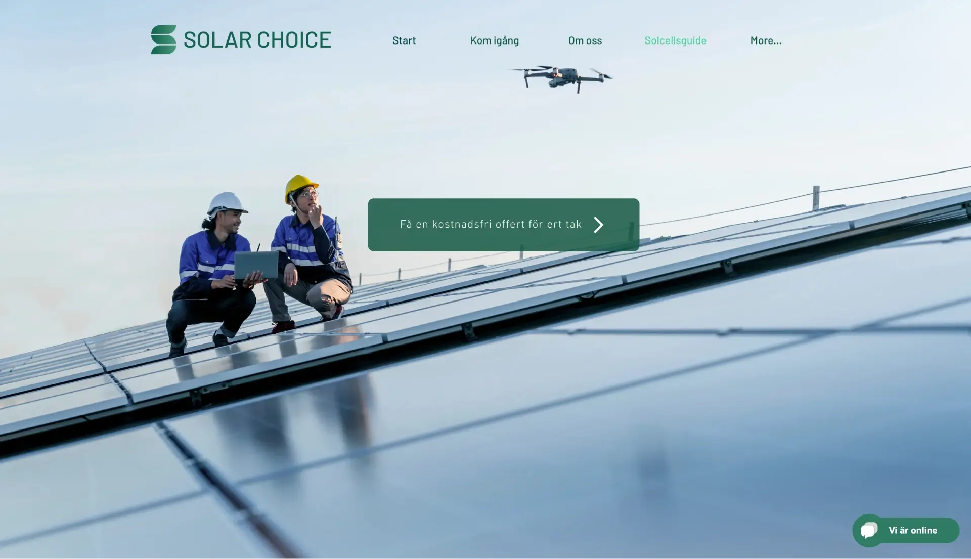
Solar Choice
Crafting a Premium Brand Identity for Solar Panels
Project Overview
- Brief: Create a visual brand document that presents the company in a understandable and appealing way to their target audience through the main communication channels.
- Team: Patric Iu, Divya Kavadia, Tessa Holgersson, and myself.
- Role: As part1 of the Design Lead program at Hyper Island in 2022, our team collaborated on this client project. My contributions spanned from designing logos and stylescapes to developing website mockups and producing extensive content for the brand book. I also led a class presentation detailing our process.
- Key Deliverables: Comprehensive Brand Book
- Tools used: Figma, Figjam, Illustrator.
- See our Work: Solar Choice website.

Team Dynamics and Initial Steps
In the initial phase, it was important for us to understand each other's strengths and work dynamics. We dedicated a few days to this, employing specific tools from the Hyper Island toolbox. Here are some of the key tools we found most beneficial:
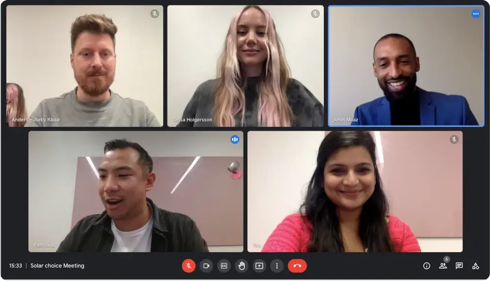
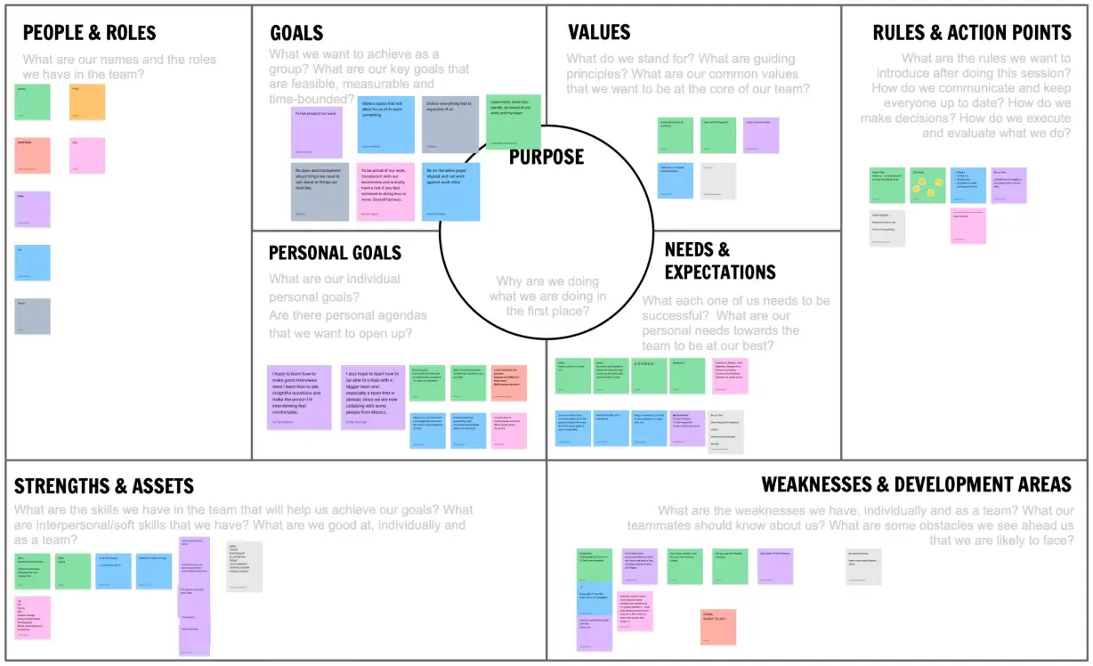
Team Canvas
This tool facilitated our alignment on individual strengths, shared values, overarching goals, and team norms. It's a tool I personally find valuable because it helped us to get everything on the table so that we can avoid misunderstandings later on.
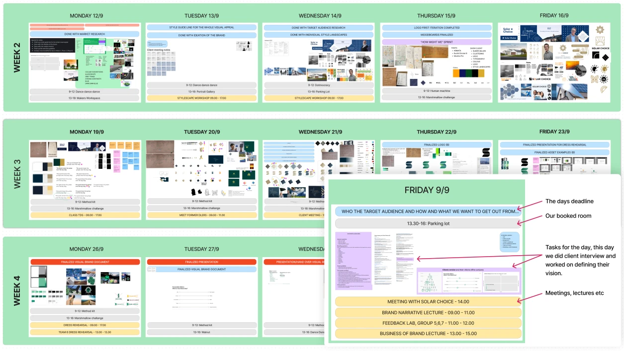
Time Management with Figjam
To stay on track and ensure everyone was synced, we structured our timeline on Figjam. This calendar helped pinpoint crucial deadlines, schedule meetings, and ensure we always began each day with a transparent and focused roadmap.
Customer Insight, our Approach to Research
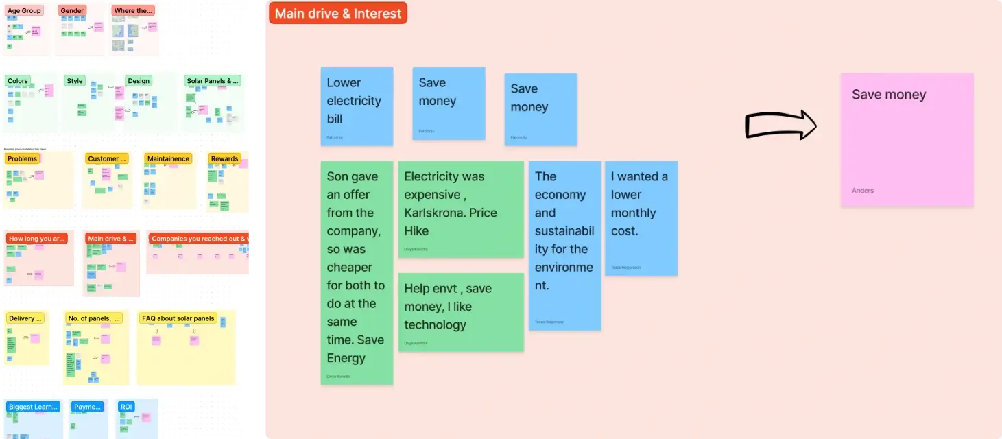
To gain a better understanding of our target audience, I reached out on solar panel groups on Facebook to find people to interview. Through these interviews, we aimed to gain insights into what was most important to our target customers.
Challenging Our Assumptions
One example of the insights we gained was debunking my initial hypothesis. I believed that environmental considerations were paramount to solar panel buyers. However, when we posed unbiased questions, we discovered that the primary motivation was the allure of saving money. Discoveries like this were instrumental in tailoring our brand visuals and messages, ensuring that we were creating a brand that truly resonated with our target audience.
Research Process Breakdown
To ensure our findings were relevant, we set up a methodical research process:
- Structured Interview Guide: A tool to maintain consistency and depth across all interviews.
- Interactive Zoom Sessions: Live interviews with solar panel owners, complemented by a dedicated note-taker to capture all insights.
- Clustering Technique: After collecting responses, we categorized similar answers into overarching themes.
- Deriving Key Insights: From these clusters, we derived significant insights that became the foundation of our brand development efforts.
Establishing Brand Identity
To successfully communicate a brand's essence, it's essential to define the brand personality and the vision of its stakeholders.
Diving into Brand Personality
Through dialogue with our client in a workshop, we not only deciphered their current perspective of their brand but also mapped out their future roadmap so our branding would stand the test of time.

Key Insight
Our client envisions Solar Choice as a premium provider. Their unique selling point isn't price but the unmatched quality they offer, working exclusively with the market's finest panels.
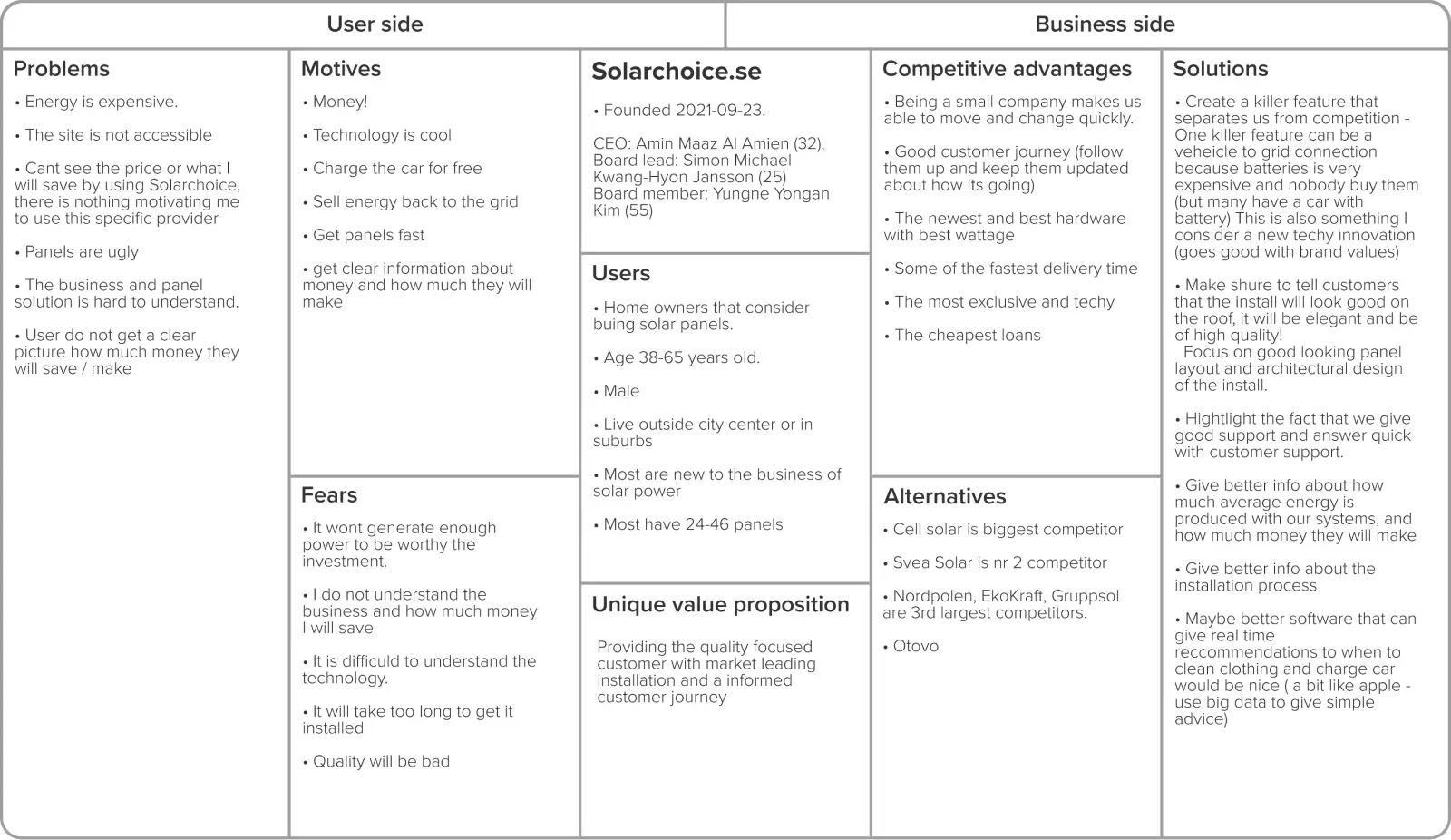
UCDC - User-Centered Design Canvas
The User-Centered Design Canvas (UCDC) stands out as one of my go-to tools. It offers a comprehensive overview of a company, shining light on potential avenues from both business and user perspectives. Throughout our project, the UCDC acted as a dynamic reference point, continually updated to reflect evolving insights.
Crafting a Brand's Visual DNA
A brand isn't just about logos or colors; it's the very essence that resonates with its audience. This essence stems from core values, beliefs, and personality traits. To encapsulate this essence visually, a structured and deep-rooted design process is imperative.
Defining Brand Values
Collaborating with our client, we delved deep into Solar Choice's ethos, aiming to extract the inherent values and personality traits that form its core. Our iterative process of brainstorming and feedback led us to distill these vast notions into four definitive brand pillars:
- Innovative: Pioneering in offering cutting-edge, technologically novel solutions.
- Trustworthy: Guaranteeing native, Swedish-speaking installers for authentic interactions.
- Premium: An unwavering commitment to purvey only the elite panels and equipment.
- Journey: A holistic approach to customer service, guiding clients from initial order, through installation, and beyond, ensuring consistent satisfaction.
These pillars acted as our North Star throughout the design phase, guiding our choices to ensure a cohesive and genuine brand portrayal.
The Birth of Stylescapes
Armed with a robust understanding of Solar Choice's brand identity, we transitioned into the visual exploration phase. Here, we translated our textual understanding into tangible moodboards and stylescapes. These visual representations offered the client glimpses into potential brand design directions, allowing them to envision Solar Choice's future identity.
My stylescapes:


Our Color and Logo Process
Crafting a logoq is an intricate art. The logo is more than just a graphic; it's the embodiment of a brand's ethos, values, and aspirations. Similarly, color isn't merely an aesthetic choice but a vital component in evoking desired emotions and perceptions.
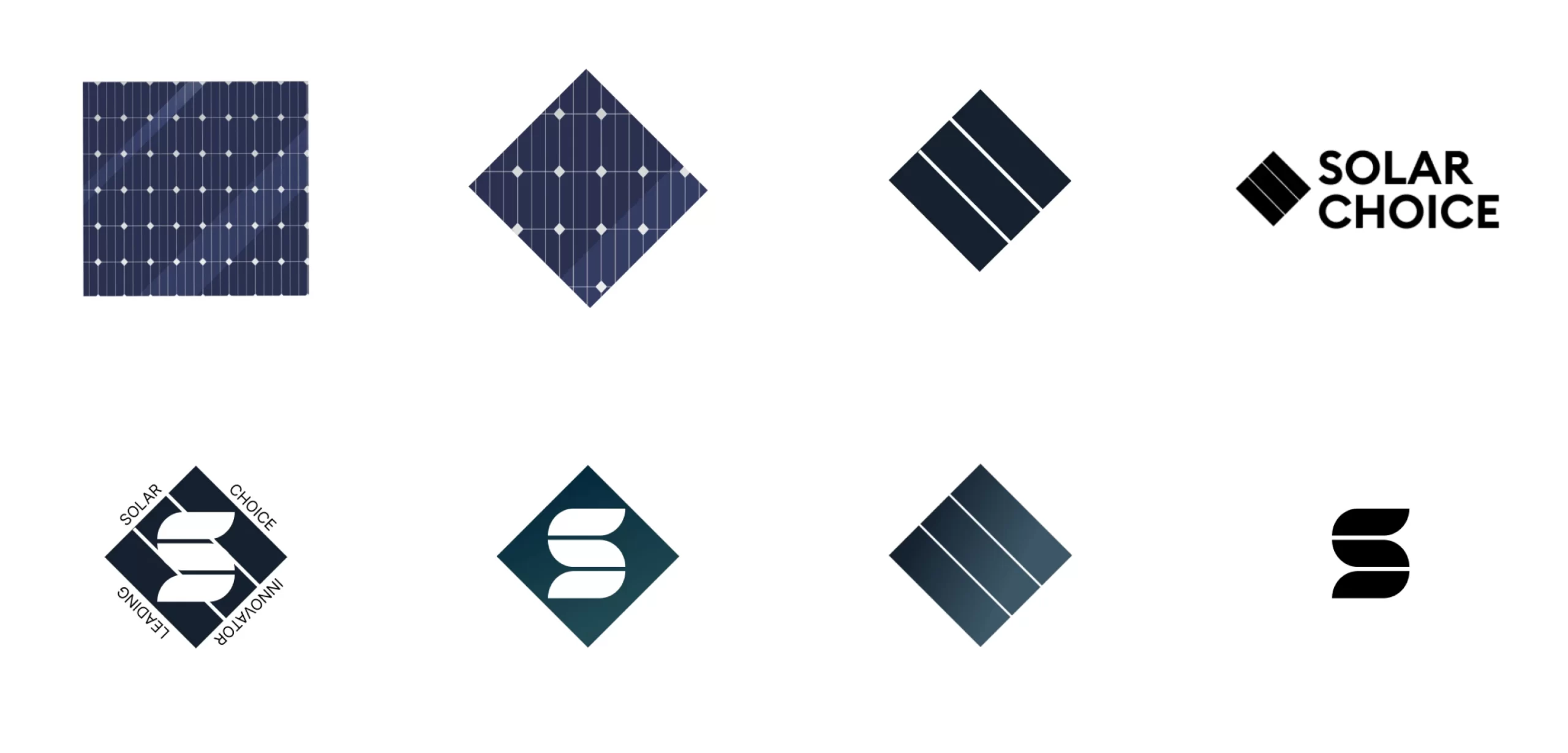
Diamond in the Rough
Looking at the actual solar panels, I was inspired by the diamond shape in the panel structure. The diamond is not only an representation of strength but also exudes an aura of exclusivity. By stylizing this shape, I sought to manifest these attributes in Solar Choice's logo, representing both their focus on premium products and robustness.
Logo End Result: Killing Your Darling
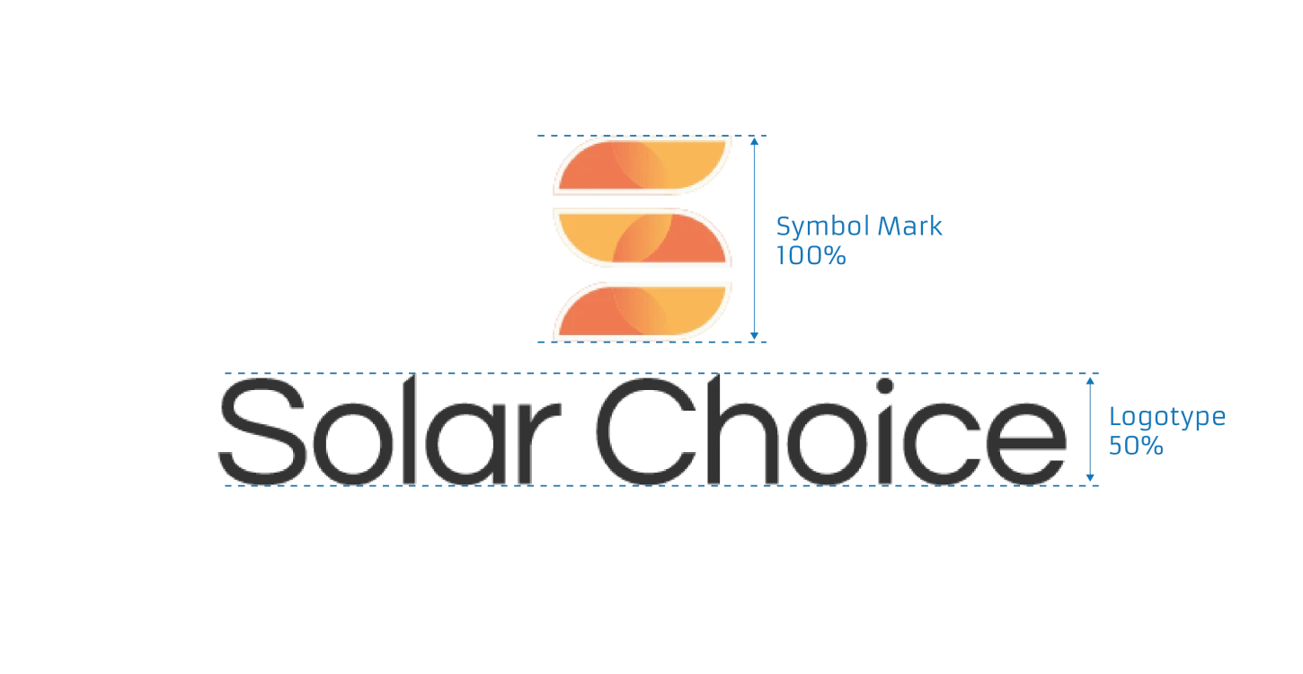
Navigating the redesign of a logo always needs a balance between innovation and brand preservation. While our initial new logo suggestions resonated with the client, there was a clear desire to maintain the essence of their existing identity. Recognizing this, we approached the task with a focus on refining their current logo. My recommendation was to streamline and contemporize the existing design, culminating in a more flattened and modern look.
Here is the results, old and new logo:
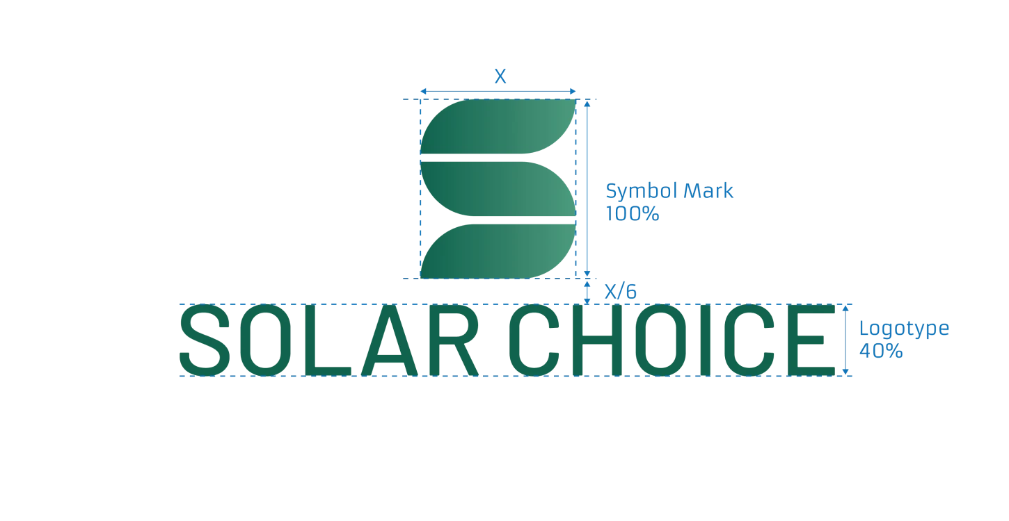
Versatility in Design: Variants and Monochrome
Adapting to diverse applications and ensuring consistent representation is crucial in branding. Keeping this in mind, we conceptualized a new format tailored for the webpage header, mirroring our envisioned aesthetics. Furthermore, in anticipation of scenarios like black & white printing or lower-resolution, we created monochrome versions. These serve as reliable alternatives, ensuring the logo's integrity across varied contexts.


Painting the Brand: The Colour Palettes
Colors play a crucial role in brand perception. Initially, we proposed a dark blue and gold palette. However, our client's vision led us elsewhere. Taking their feedback constructively, we crafted three novel palettes: 'Blue Lagoon,' reminiscent of deep waters; 'Northern Light,' playing on the beauty of the northern light; and 'Emerald,' a gem of vivid green. The latter, 'Emerald,' won the client's heart. This palette choice couldn't have been more fitting. It's not just contemporary and refreshing but also seamlessly aligns with Solar Choice's commitment to sustainability and pioneering spirit.
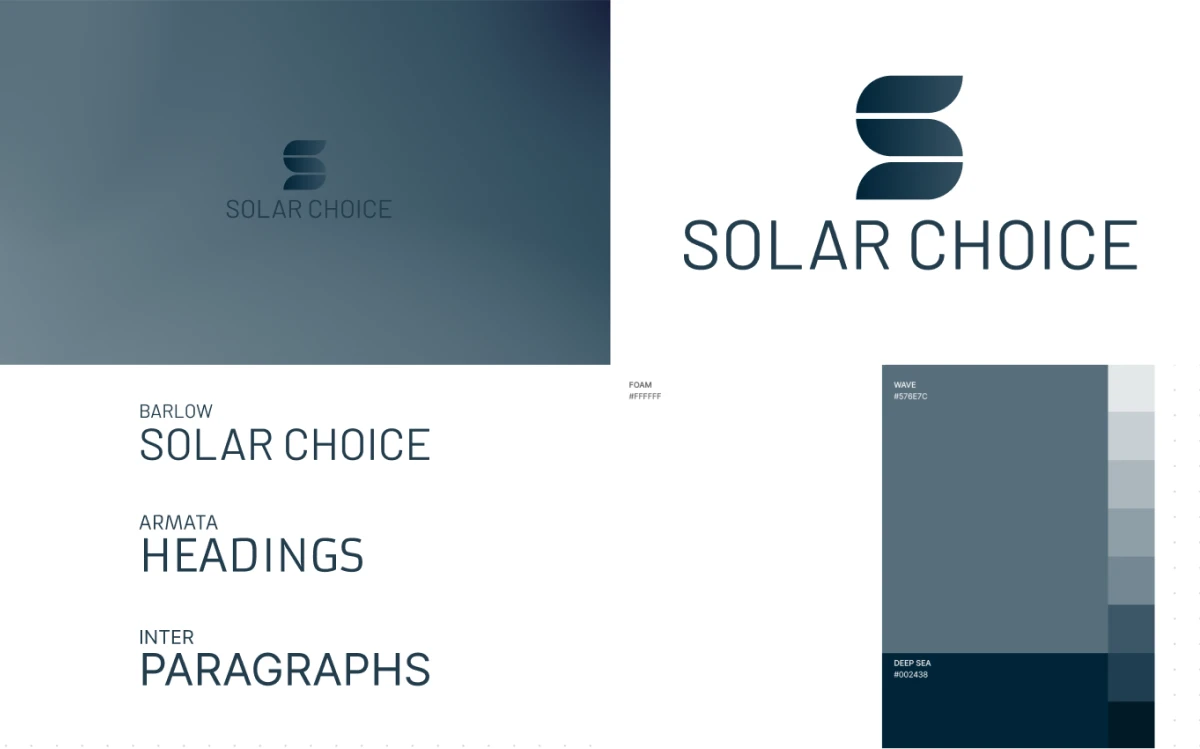
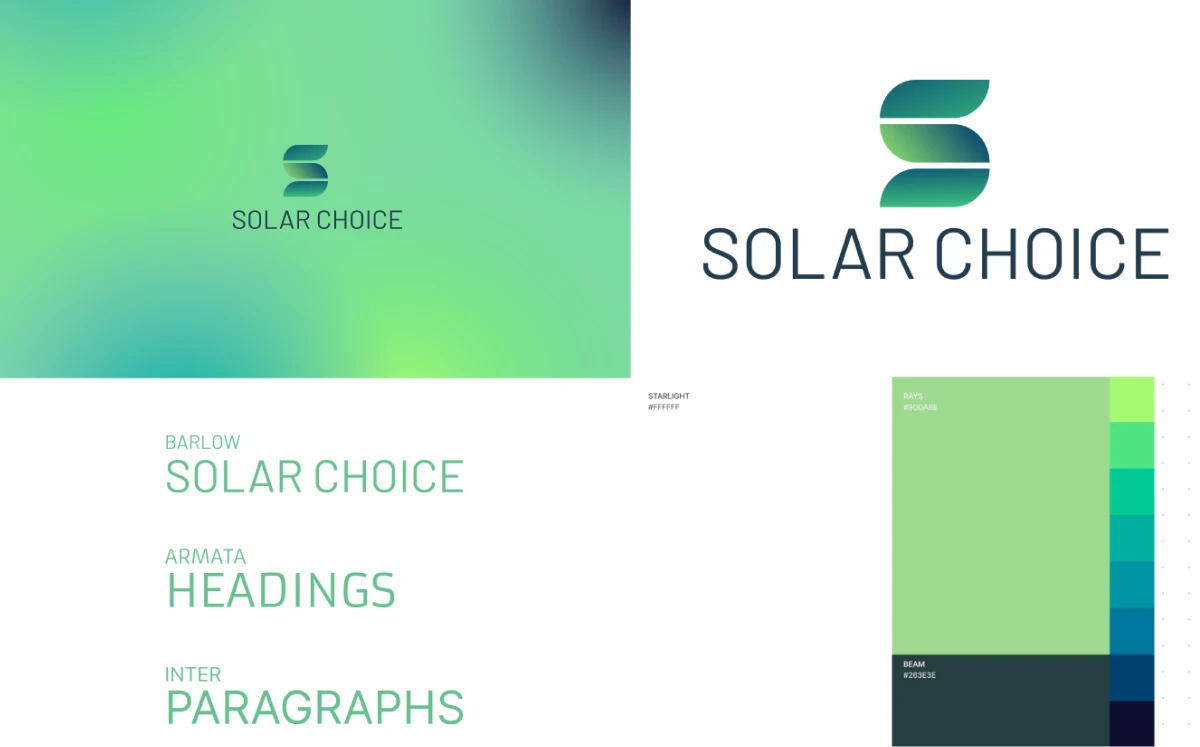
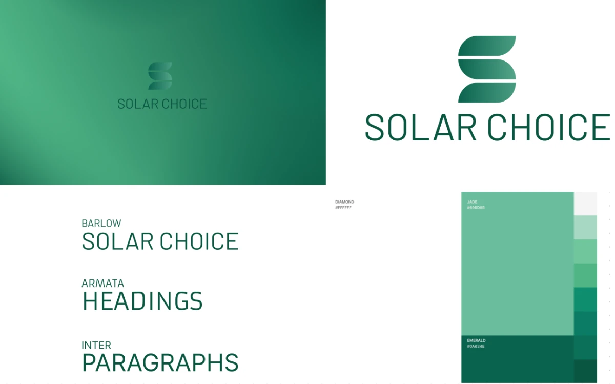
Webpage Mockups
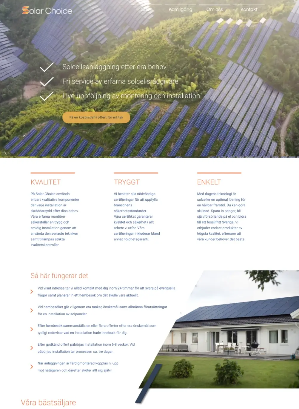
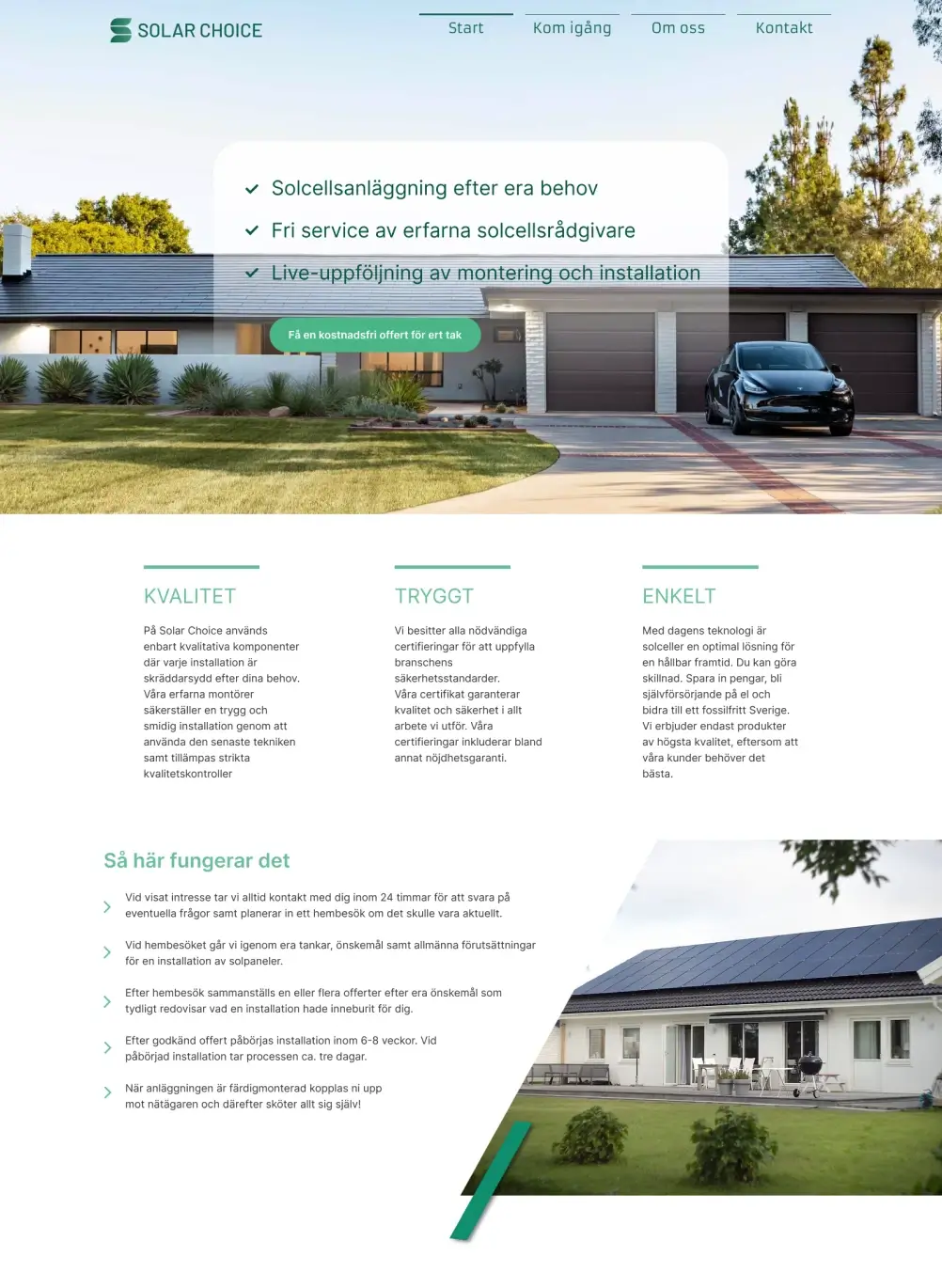
To give life to our newly crafted visual identity, I designed a set of webpage mockups. These mockups served as a practical illustration, enabling the client to envision the transformation of their website with the integration of the fresh design elements. Here comparing old page on the left and mockup on the right side:
Achievements and Insights
Our effort to create a new brand identity for Solar Choice was a success.
- Swift Rollout: three weeks post the unveiling of the final brand book, the client astoundingly rolled out the new branding on every platform, including a revamped Solar Choice website
- Effective Collaboration: This quick implementation is a testament to the effectiveness of our design process and the strong partnership we established with the client.
- Effective Hyper Island Methods: The foundational work we did with Hyper Island methods, creating team alignment and structure, proved to be very valuable. It not only facilitated seamless collaboration but also made sure our workdays were filled with a lot of joy and fun!
