Svenska Mässkonsult
A Rebrand Journey with Hyper Island
Introducing Svenska Mässkonsult
- Svenska Mässkonsult build exhibition spaces. They reached out to Hyper Island for a rebrand. Our design lead class were doing a module where we ran our own design agencies in groups at Hyper Island and took on paying clients.
- Project Brief & Objectives: We need help to review/re-invent how we are seen externally, both offline and online. Today we lack a common thread in our communication and that is something we need to be able to develop and implement in printed material, website, mail signatures, invoices, proposals and other profiling.
- Team Composition & My Role: Our team consisted of five designers. Two focused on branding while the other two, including myself, concentrated on UX. I took the lead in the UX process and collaborated closely with designers Viktoria and Catalina. My responsibilities was leading the UX process, UI/UX/Web-design, prototyping, user testing, handoff and presenting the final design.
- Key Tools & Project Timeline: Figma, Figmjam, Adobe CC. We spent around 5 weeks on this design process.
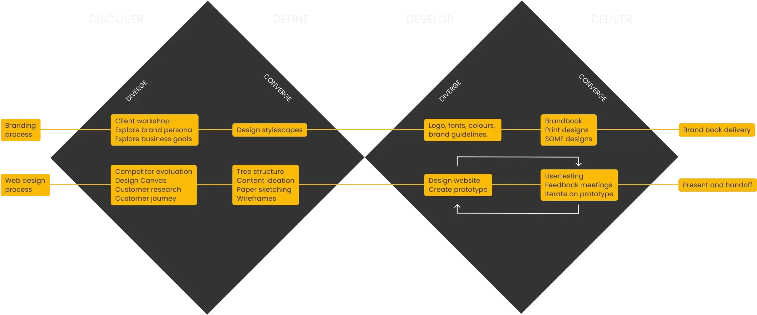
Double Diamond: Our Methodological Approach
Balancing Branding with Website Design
After our initial meetings we decided we had time to deliver a brandbook, print materials and a webpage design in about five weeks where 2-3 days a week went to lectures. To save time, we decided to divide the team and work side by side on the two main deliveries, the branding and the website.
Mentoring in UX Design
I led two designers that was new to UX trough a double diamond process to design the website.
The Discovery Phase: Understanding Our Client
Engaging in Client Workshops
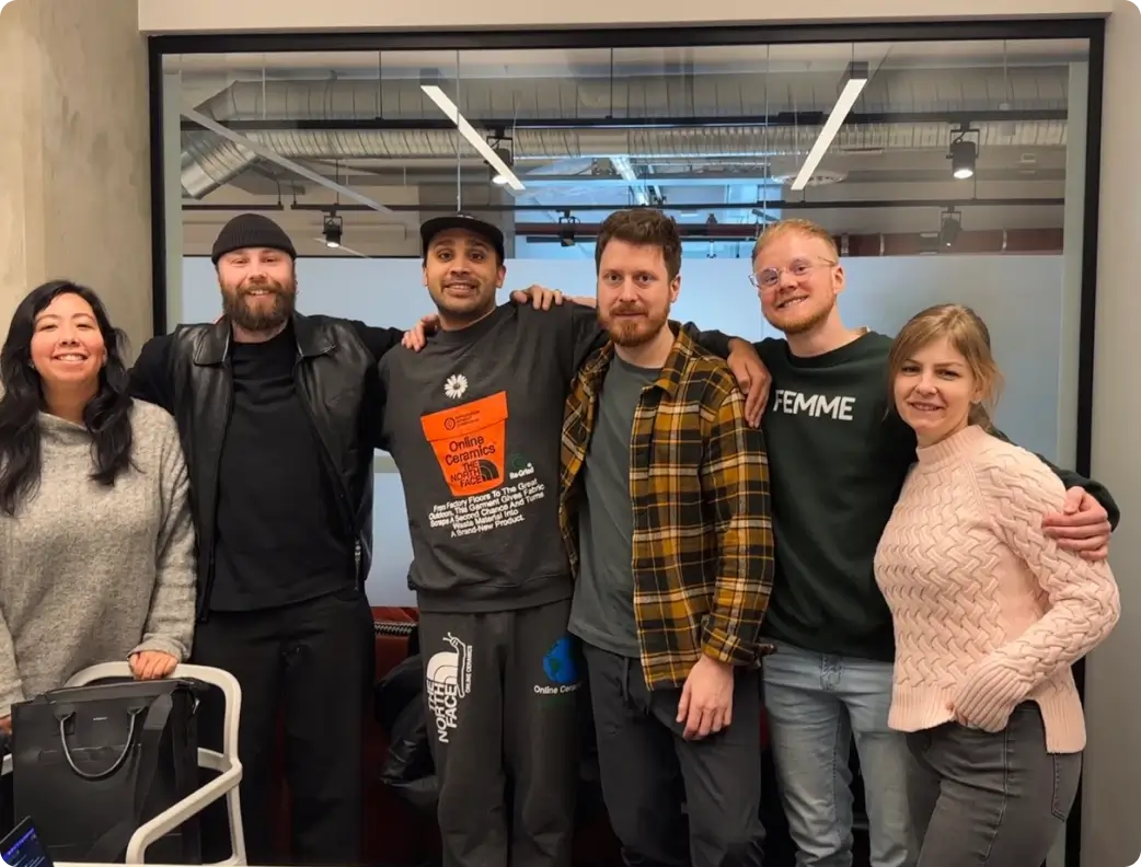
The first step in the design process was to understand the clients needs and goals. We held workshops and had meetings to learn as much as we could about the company, their customers and their branding and website goals.
Getting Insights from Competitors
We reviewed the client's existing website and visual identity, and we evaluated their competitors' websites. This helped us to understand the clients current strengths and weaknesses, and it gave us insights into the opportunities for improvement.
Customer Journey: From Empathy to Insight
Mapping the User Experience
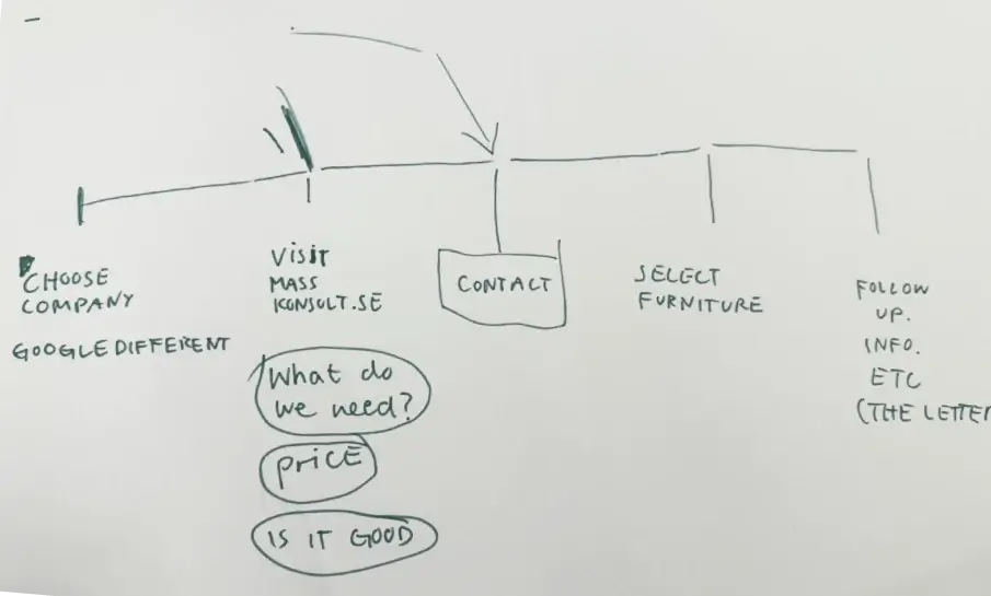
We created a simple customer journey map to empathize with the target customers and identify their pain points and where they were likely at in their journey before and when they reach the website. This helped us to understand the users point of view and to identify areas where the website could improve the customer journey.
Challenges with Svenska Mässkonsult's Online Presence
- If you search on Google for exhibition builders, exhibiton stand builders, or even the company by name - the webpage was hard to find.
- It was hard to understand exactly what value they offer from reading their webpage.
- Their online presence undersold their capabilites.
- Their website lacked trust building elements, like reviews or statements from their customers.
Crafting the Brand: Workshops to Final Choices
Interactive Brand Exploration
We held a workshop with the client where we used some exercises to explore their brand. This helped us identify how the company saw themself and how customers saw them.
The Evolution of Stylescapes
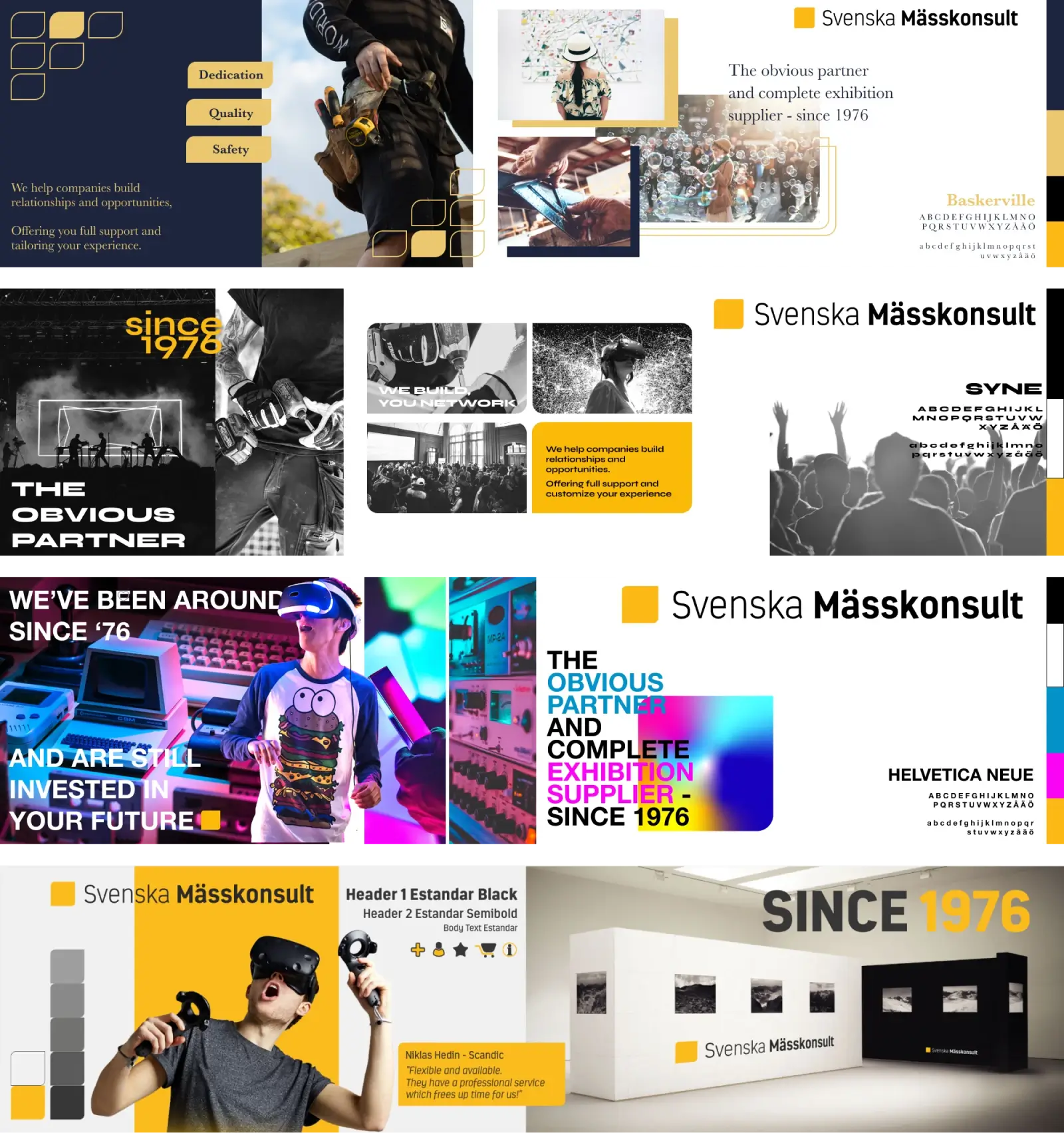
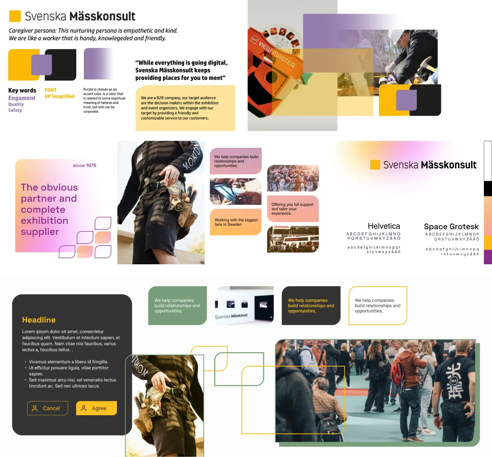
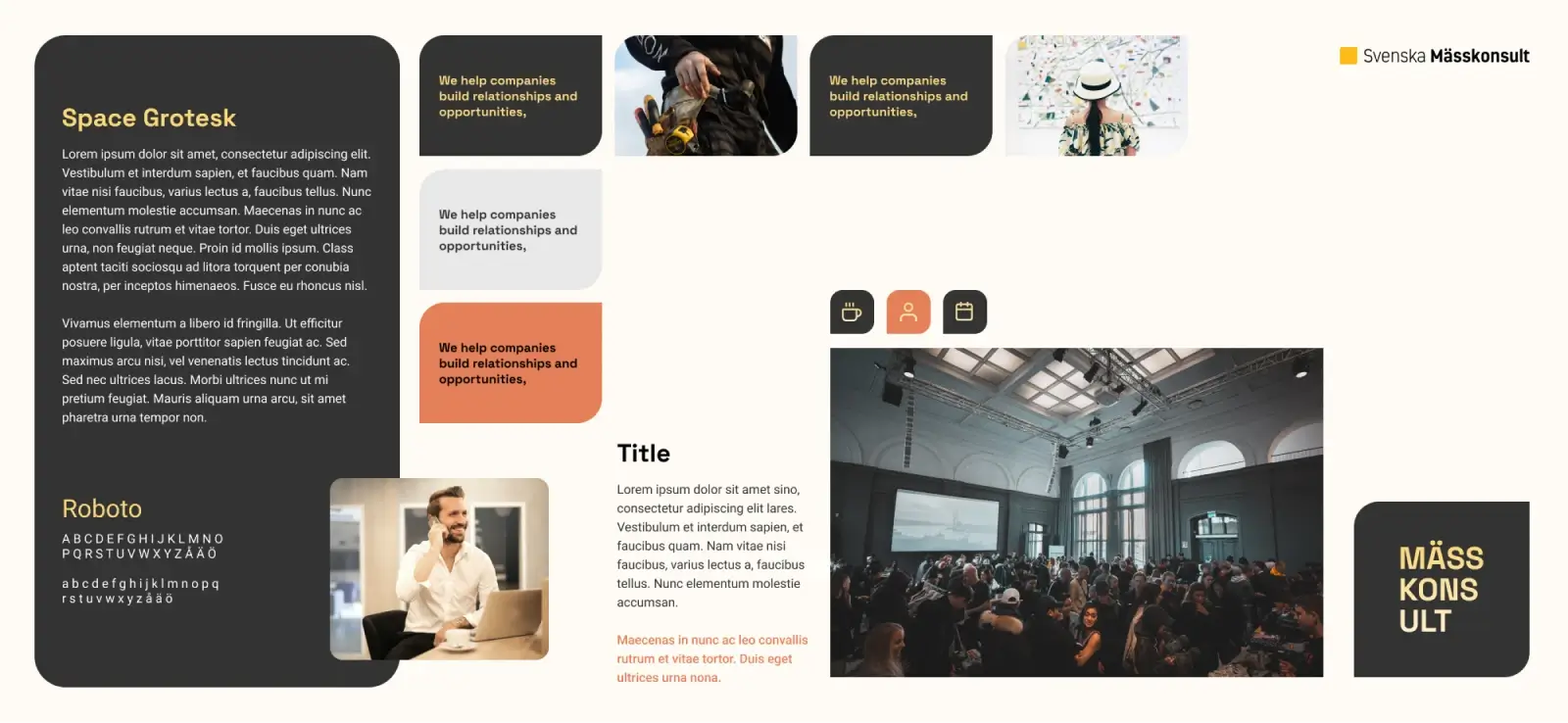
From our insights we did three rounds of stylescapes that we presented to the client.
Navigating Diverse Opinions
In the end the founders of the company wanted to keep their colour and logo but add a secondary colour, graphical elements based on their existing logo, adding a new font. This was a interesting part of the process to navigate because the different people in the company did not always agree on the direction.
Defining, Planning & Structuring
Defining Content and Structure
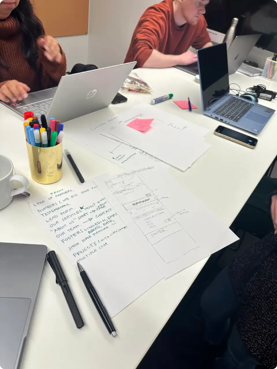
We defined what to include, then sketched out each page.
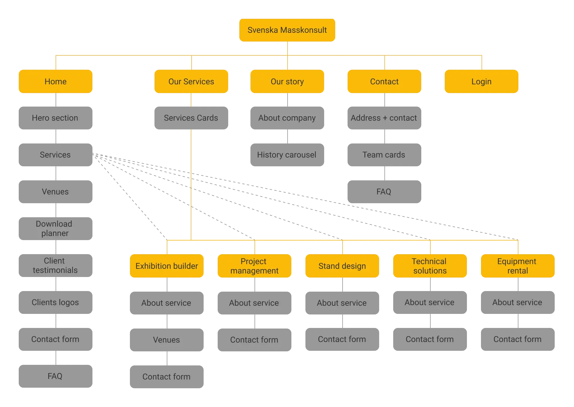
SEO-driven Sitemap Creation
To optimize SEO, we created separate subpages for every primary service offered by the company. This strategy added improved interlinking and content depth, both key for improved search rankings. We meticulously mapped out all sections to keep track:
Design Process
From Sketches to Wireframes
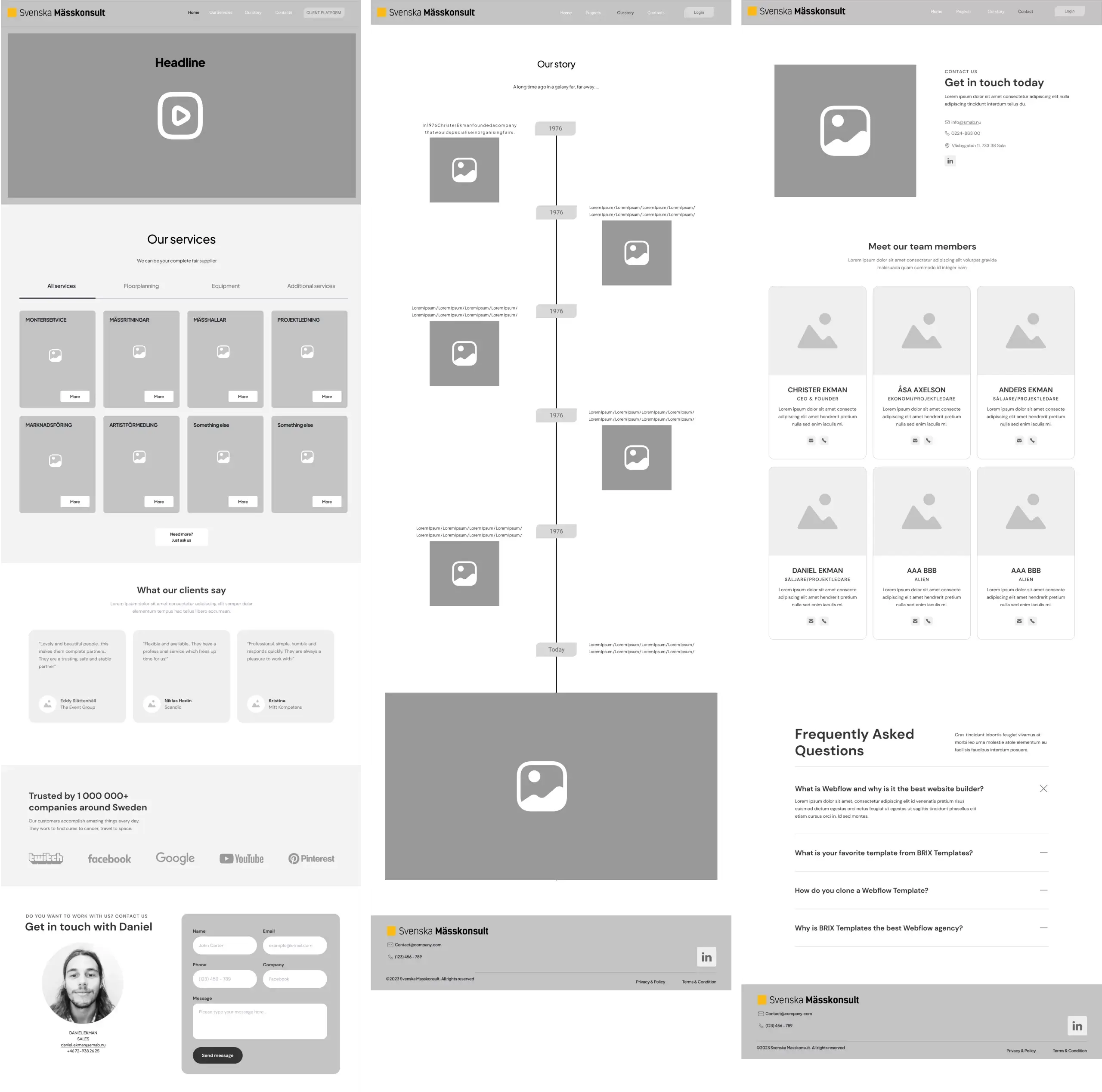
We first sketched out all screens on paper, discussed our sketches and then transformed the final sketches into wireframes in Figma. This process gave us to keep a strong focus on the content and layout.
High Fidelity Designs
Transitioning from wireframes, we developed high-fidelity designs, infused with colors and images, resulting in a comprehensive page prototype. For instance, the "About/History" page underwent various iterations before culminating in a streamlined carousel/slideshow.
User Experience Testing
Testing Methodology
We did an extensive user testing of our prototype, aiming to validate its design integrity and user-friendly navigation. Filming these sessions allowed us to review and analyse them together.
Navigational Insights
An intriguing find from our tests was the users intuitive reliance on the top-left logo for navigating back to the homepage, this eliminated the need for a separate menu element for navigating to home.
Final Deliverables
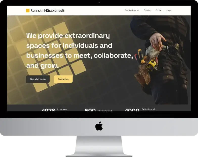
Frontpage Evolution
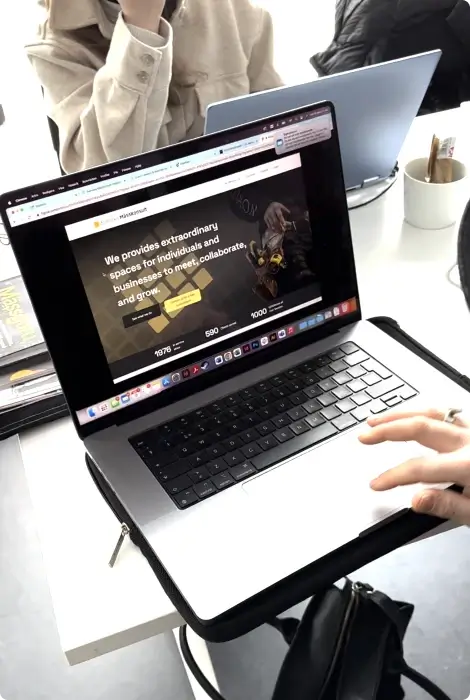
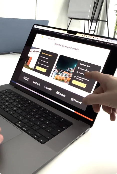
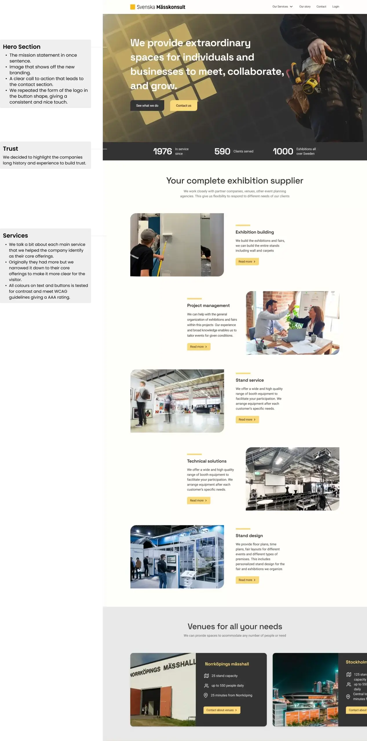
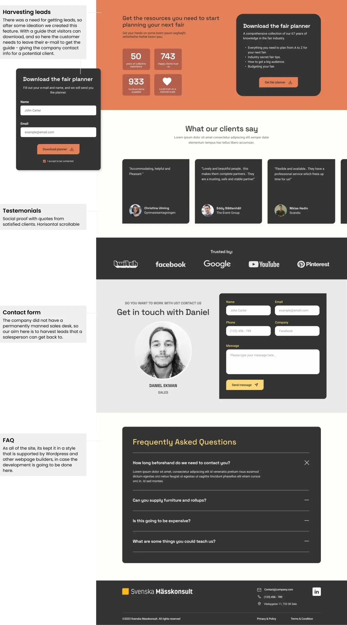
A deep dive into the design decisions behind our front page:
Final Prototype:
Dive into our final prototype:
Reflections & Learnings.
This project was both a display of our skills and a journey of personal growth and understanding.
- Team Synergy: Leading the UX process and working alongside the branding team showcased the power of teamwork. We accomplished more together than I thought possible.
- Time Management: Tight schedules reinforced the importance of good planning. We had to be strategic and focused throughout the project.
- Teaching and Learning: Introducing Figma to my team was both a challenge and a rewarding experience. Sharing knowledge with my colleagues and helping them master new tools was fulfilling.
- Client Relations: Our coursework on stakeholder management was incredibly helpful. It emphasized the importance of setting clear expectations to avoid constant changes and ensure the quality of our deliverables.
- Feedback and Growth: I learned a lot about my leadership style. In situations where I felt a task wasn't done right, I should've provided clearer guidance instead of intervening directly. This was a significant learning point for me.
- Responsive Over Mobile-first: I would've preferred a mobile-specific design, but due to time limits, we chose a design that would work well on all devices.
- Client Satisfaction: A highlight of the project was the client's positive feedback and their decision to bring our designs to life and implement it. It was a testament to the team's effort and commitment.