Designmaskinen
Minimalistic admin area & template builder
What is Designmaskinen?
Designmaskinen is a design tool for both print and digital. Unlike tools like Canva, Designmaskinen is unique because of its constraints and fixed templates. End users are limited to only use predefined brand colors, typeface and images when creating content. This way, the output is always looking great, on-brand and consistent! This empowers everyone in the organisation to create stunning designs, and is a total dream for the designers responsible for brand guidelines being followed.
Project Details:
Brief: Design an admin area.
Team: Randi Giovertsen, Kaja von Dombug, Michael Hermansen and Knut Sorknes.
Role: Research, design, prototyping, and testing.
Link: Netlife design - Designmaskinen
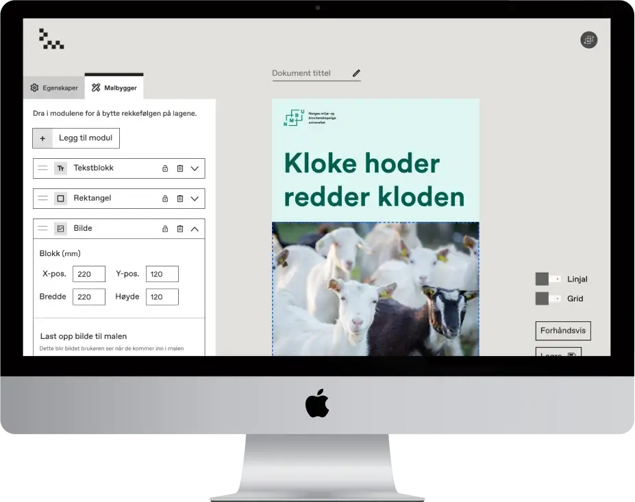
The brief: Design an admin area to ease the job of developers.
Designmaskinens user base grew rapidly. Until now, the developers were manually adding brand
assets like fonts and colors to the database and hardcoding each design template manually.
Using developers time to handle these typical CMS tasks were starting to affect the
business viability,
both being expensive and taking up too much time. The solution? Develop an admin area where power-users
can manage their templates and assets themself.
Research: Customer journey mapping
Explore all possible options
To design the best possible experience, I investigated all possible pathways for admin users
to set up Desingmaskinen. From considering purchase, to setting it up for their organisation
and adding access for their users. I explored multiple potential customer journeys, ensuring
my coming design decisions would be backed by a solid understanding of user's needs
and expectations.

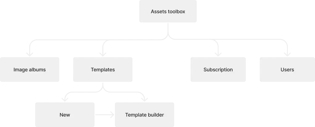
Defining: Minimalistic Architecture
Simplicity creates ease-of-use
One of the core values of Designmaskinen is simplicity, on the wall hangs the slogan: "we want to be a Doro phone - but for design"
And so I streamlined the admin area with focus on minimalism and simplicity. My goal and objective?
Design an intuitive experience,
removing all clutter and “extra” pages, to ensure ease of use!
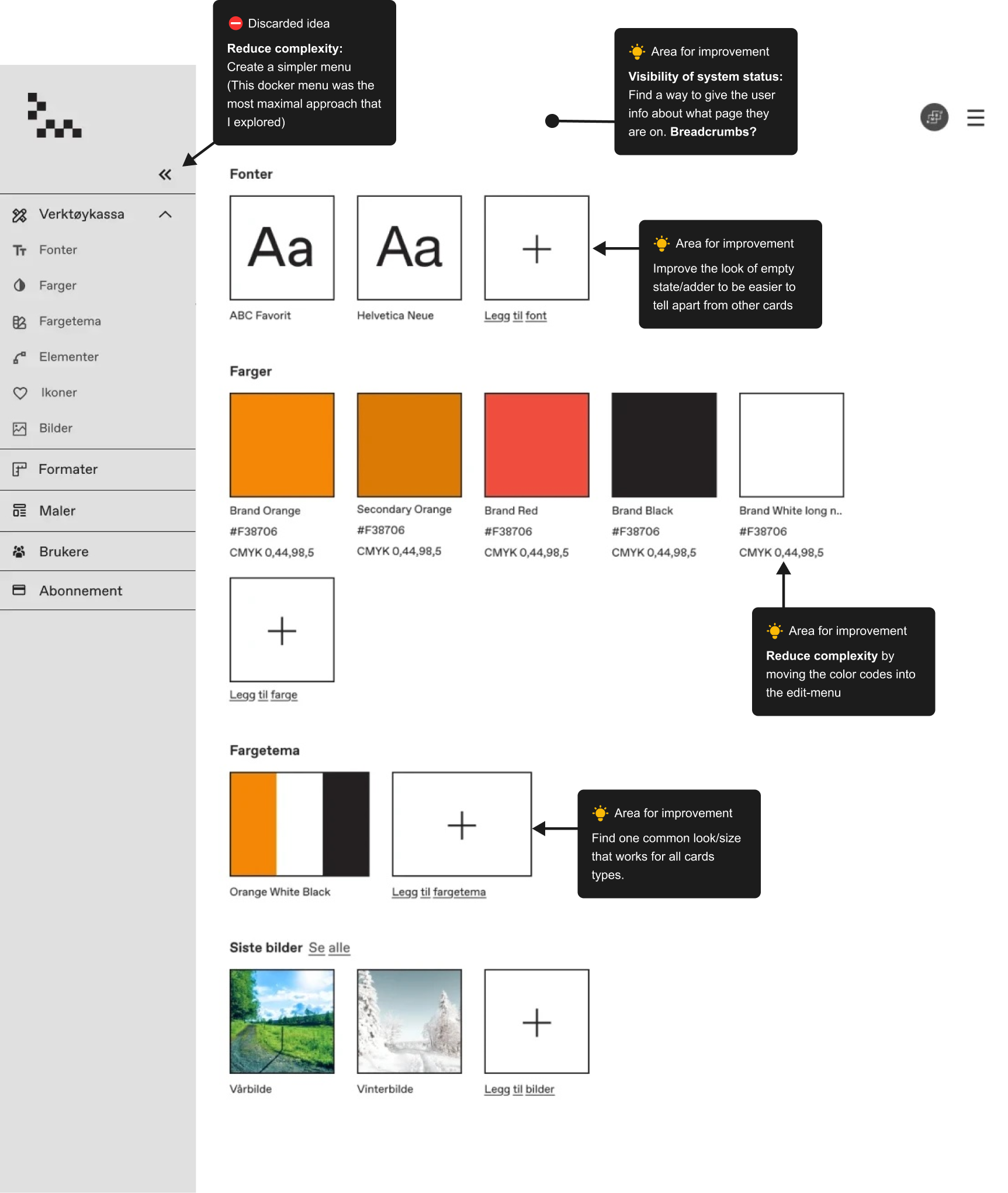
Dashboard: Iterative process, identifying areas for improvement.
- The dashboard of the admin area gathers brand assets etc. Playing with the machine lingo, Kaja came up with the great name verktøykassa (the toolbox).
- Goal: Balance ease of access with minimalism to create an intuitive feel, aligning with the brand values.
- We went from defining jobs-to-do and functionality requirements, via pencil-sketches, to me designing this first “hi-fi” iteration.
- This first version was perfect for gathering feedback from user-testing and heuristic analysis to give ideas for refinement:
Dashboard: Final design
For the finalized design, I integrated:
- A minimalistic menu design for intuitive navigation.
- Breadcrumbs to improve navigation.
- Polished cards design and grid-based layout for visual consistency.
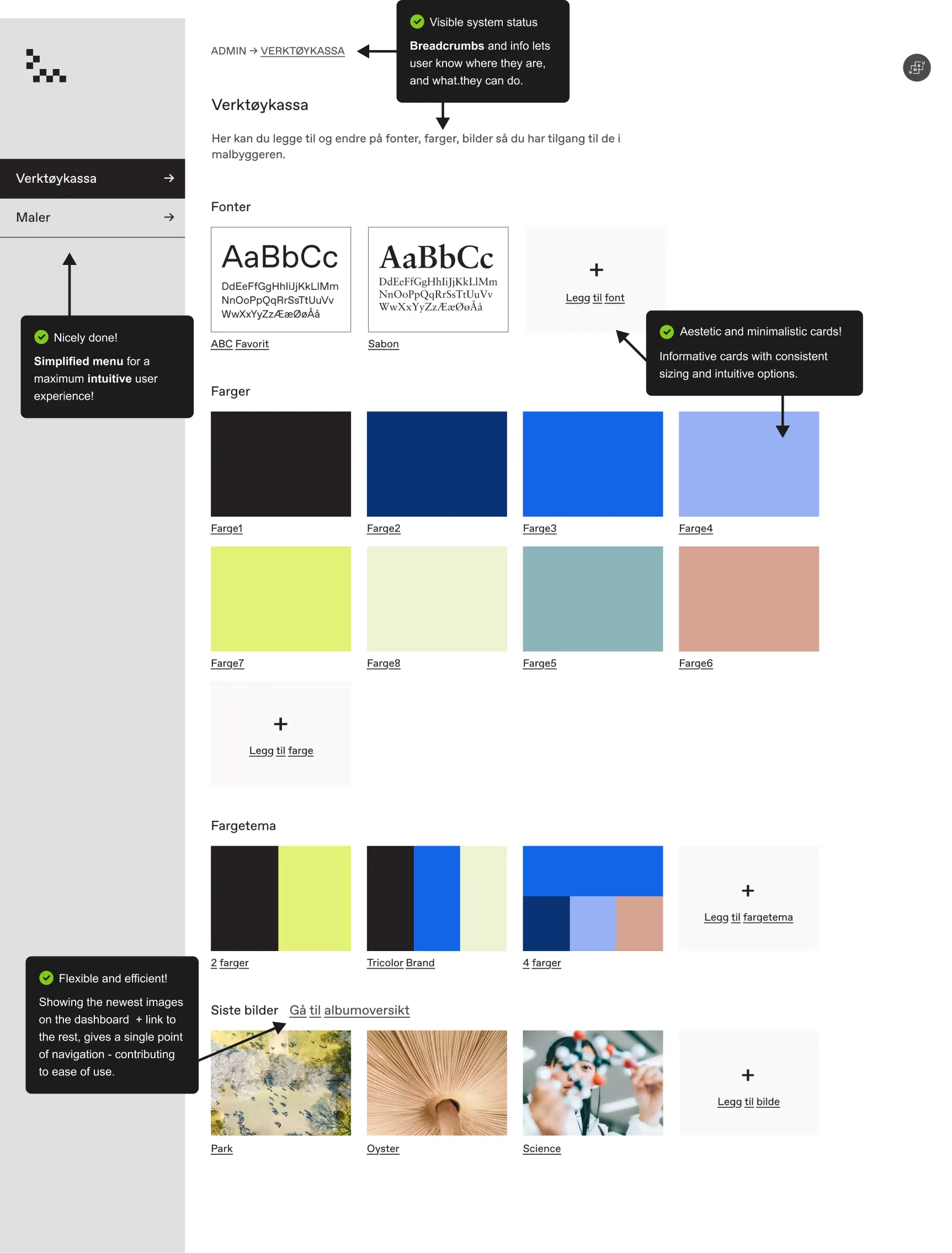
Image area: First iteration
To avoid having hundreds of images on the dashboard, we decided to create a space for them. I started defining features, then paper sketching. Then, working in iterations of interfaces, aiming to "fail fast" and move on to design improved versions. My first version held all functionality but could be improved:
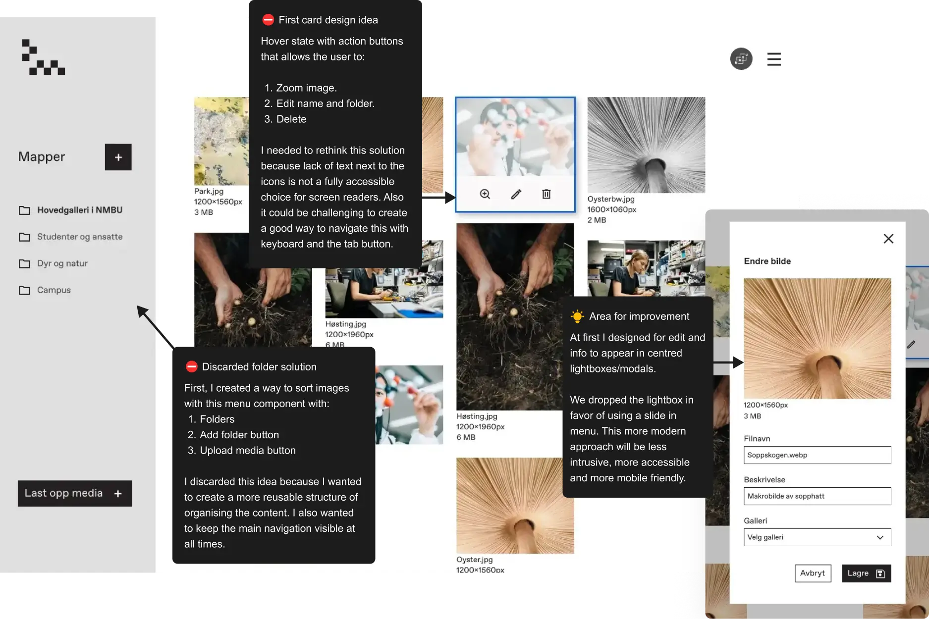
Image area: Final
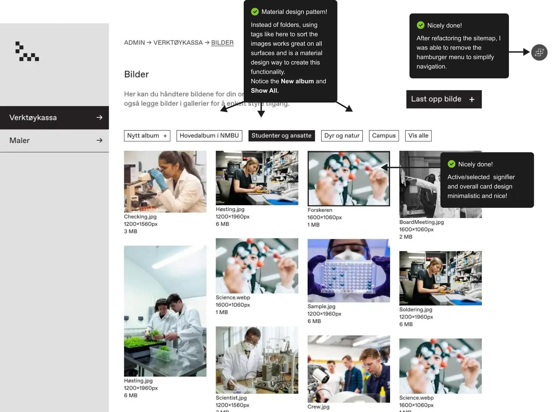
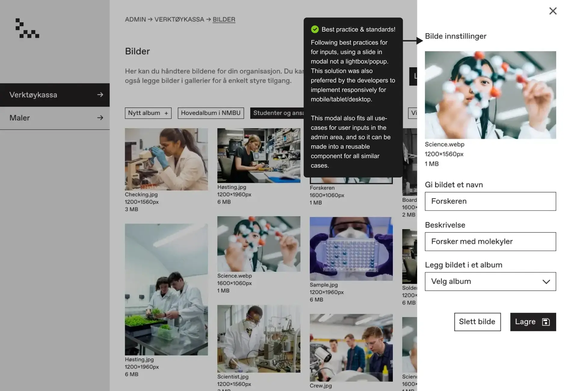
After some rounds of prototyping, testing on users, team presentations, and iterations, I had a version that both the team and I were happy with. Highlighted features:
Template area.
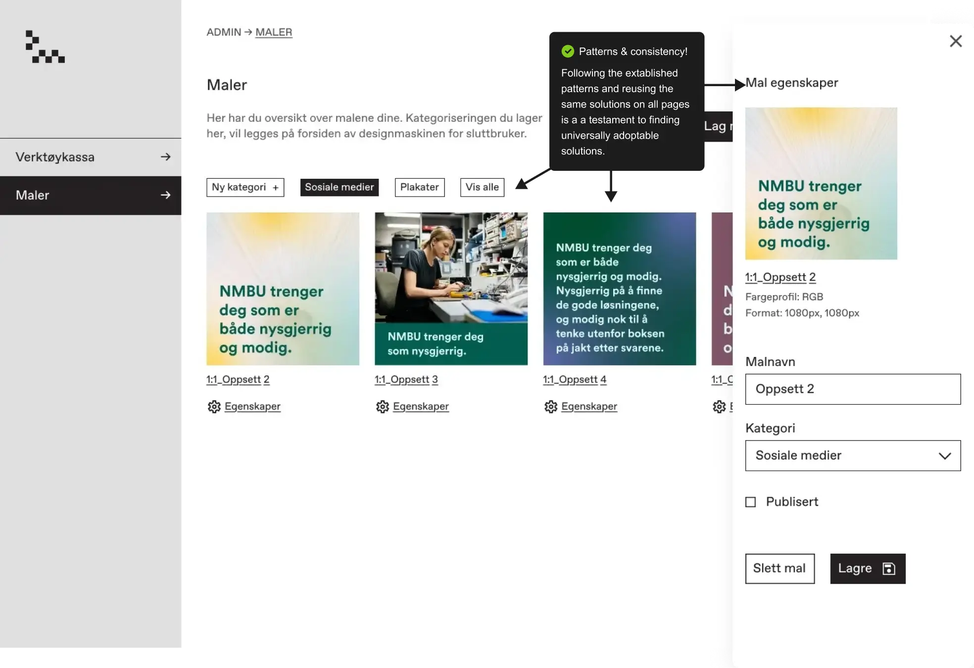
Repurposing the Image Albums Layout
During a team meeting we were discussion how the templates area should look. I argued for simply reusing the same layout that I developed for the image albums. This suggestion would ensure consistency with an established interaction pattern for the app, and address other issues we discussed about how to categorise the templates. This ended up being the final solution.
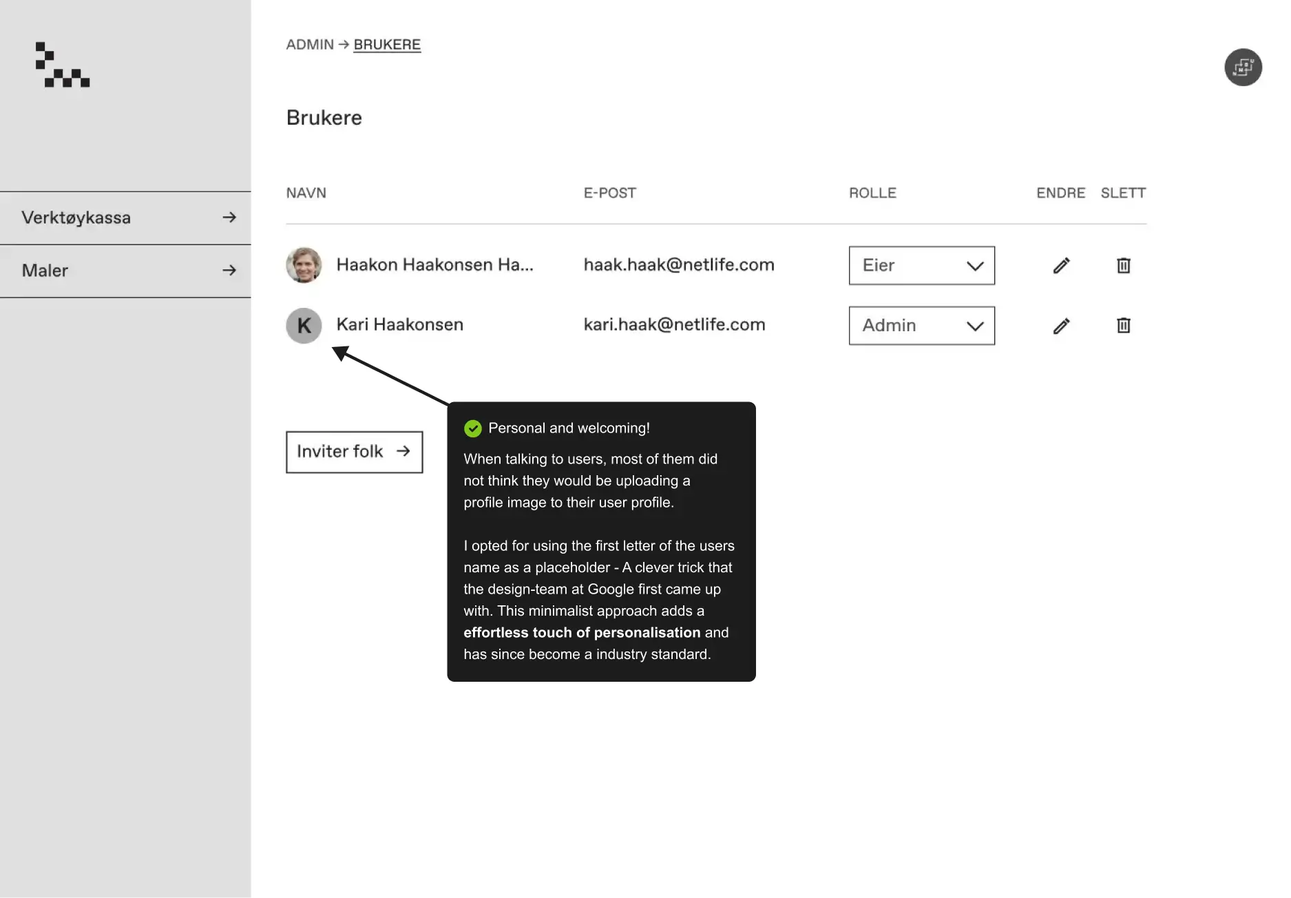
User management.
I added all basic user management functionality like invite users and edit their permissions.
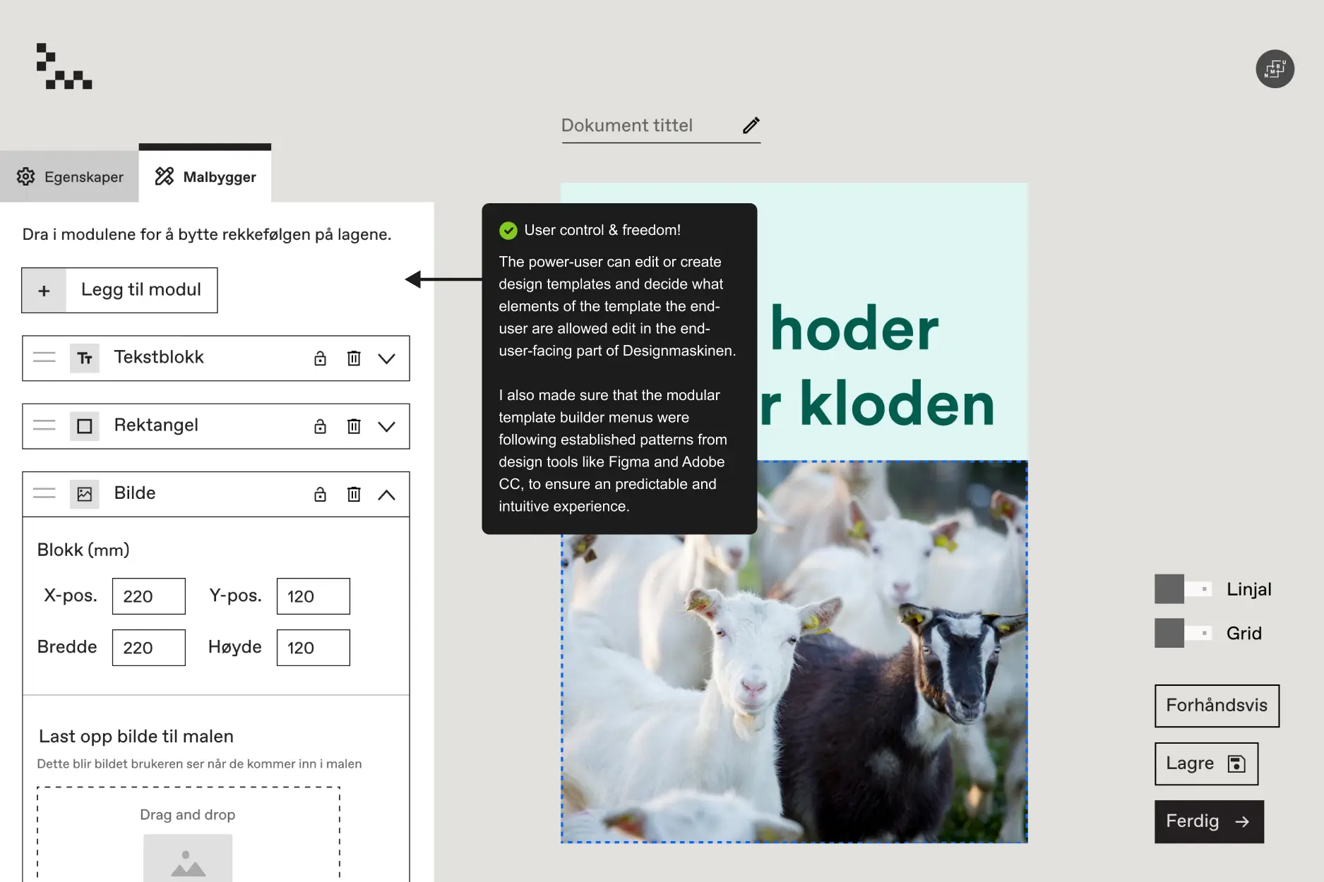
The template builder
DMy contribution to the template builder was going over the components in the design system to ensure consistency, also iterating on how options should be organised and shown in the menu. And contributing to the discussion of what options we should give the users and what should be locked.
Test Drive my Final Prototype.
My favourite part of any design process is watching the designs come to life in a prototype. It's this stage where the nuances surface, often spotlighting areas that can benefit from further refinement. Dive into the final prototype:
Reflections on My Internship
- Pros of Consultancies: Netlife Design was like a knowledge hub. They had weekly feedback sessions, presentations and skill-sharing and I learned a lot!
- Collaboration: Working in a cross-functional team with designers and developers in the same room, made it quick to ideate and shoot ideas back and forth.
- Prioritizing Accessibility: We designed for the highest accessibility and WCAG standards. I learned to design interfaces that can be used on screen readers and navigated with a keyboard.
- Repeated patterns: Using repeated patterns ensures users get a recognisable system that is intuitive and easy to use. Also this makes the developers work easier, because they can reuse components.
- Fail fast & test early: Testing early versions with users to get insights and see how things work in action is a great way to harvest feedback to continually improve!
- Social Workplace: There were a lot of social activities to join, we went grilling and playing in the park, to a design award, swimming and doing saunas and on a weekend seminar. I even joined their running team for a race - it was a lot of fun there!
- Modern Tech Stack: It was interesting to design for a cutting-edge stack with Next.js (react), Tailwind CSS, Vercel hosting, and Sanity.io for content management.
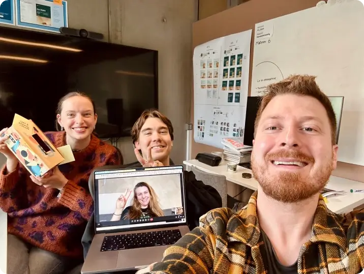
My team during a meeting.